Color Blocking by Body Shape: Where to Put the Bold Color for Your Frame
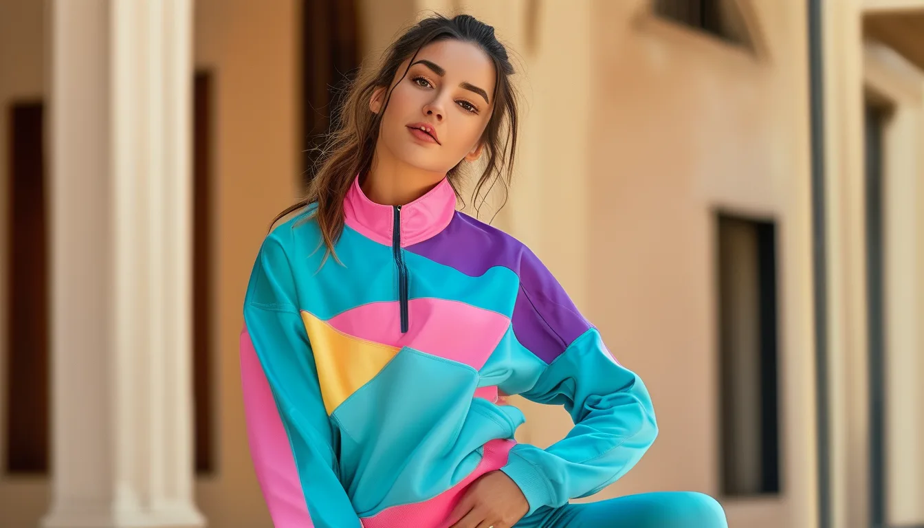
Quick Answer: Placing the bolder color block at the area you want to draw the eye toward — and the quieter color at the area you want to visually minimize — lets color blocking work with your proportions instead of against them, regardless of body shape.
Color blocking gets treated as one universal styling trick, but where the block sits on your body changes what it actually does visually — and that’s the part most guides skip entirely, defaulting instead to one generic ‘just color block’ recommendation regardless of the wearer’s actual proportions.
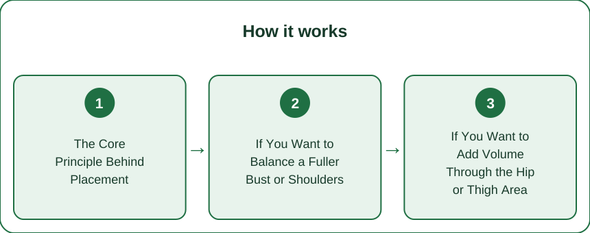
The Core Principle Behind Placement
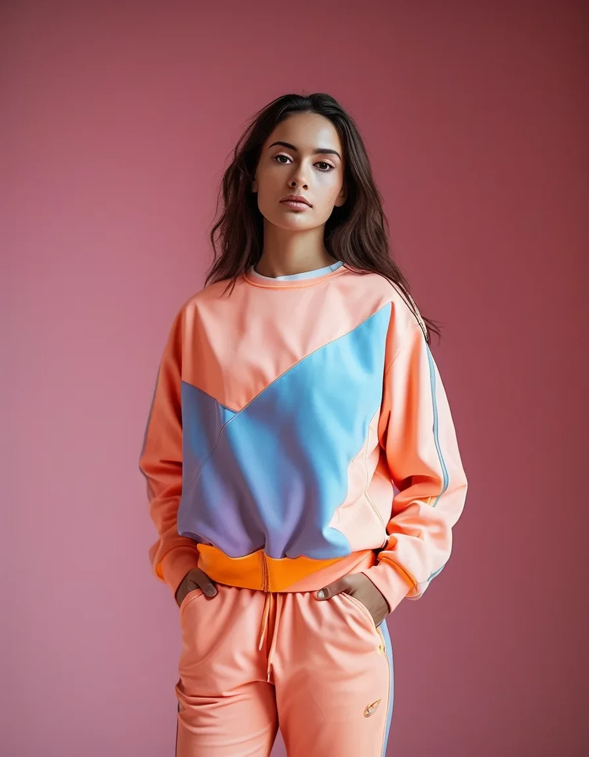
The eye is drawn to color contrast first, before shape or fit — a phenomenon well established in basic visual perception research and one that stylists apply constantly without necessarily naming the underlying mechanism. Wherever the boldest color sits, that’s where attention lands first, which means color block placement is really a tool for directing attention, not just a decorative choice made for its own sake.
If You Want to Balance a Fuller Bust or Shoulders
Keep the bold color on the bottom half (leggings or shorts) and a quieter, darker tone on top. This shifts visual weight downward and away from the shoulder line, creating a more even top-to-bottom balance without changing anything about fit or requiring a differently cut garment — the color choice alone does the visual work that a differently structured top might otherwise be needed for.
If You Want to Add Volume Through the Hip or Thigh Area
Flip the placement: bold color on top, quieter tone on the bottom half. This draws the eye upward first and creates the impression of more balanced proportions between upper and lower body, using the same underlying contrast principle in the opposite direction from the bust-balancing approach above.
If You Want an All-Over Balanced, Elongating Look
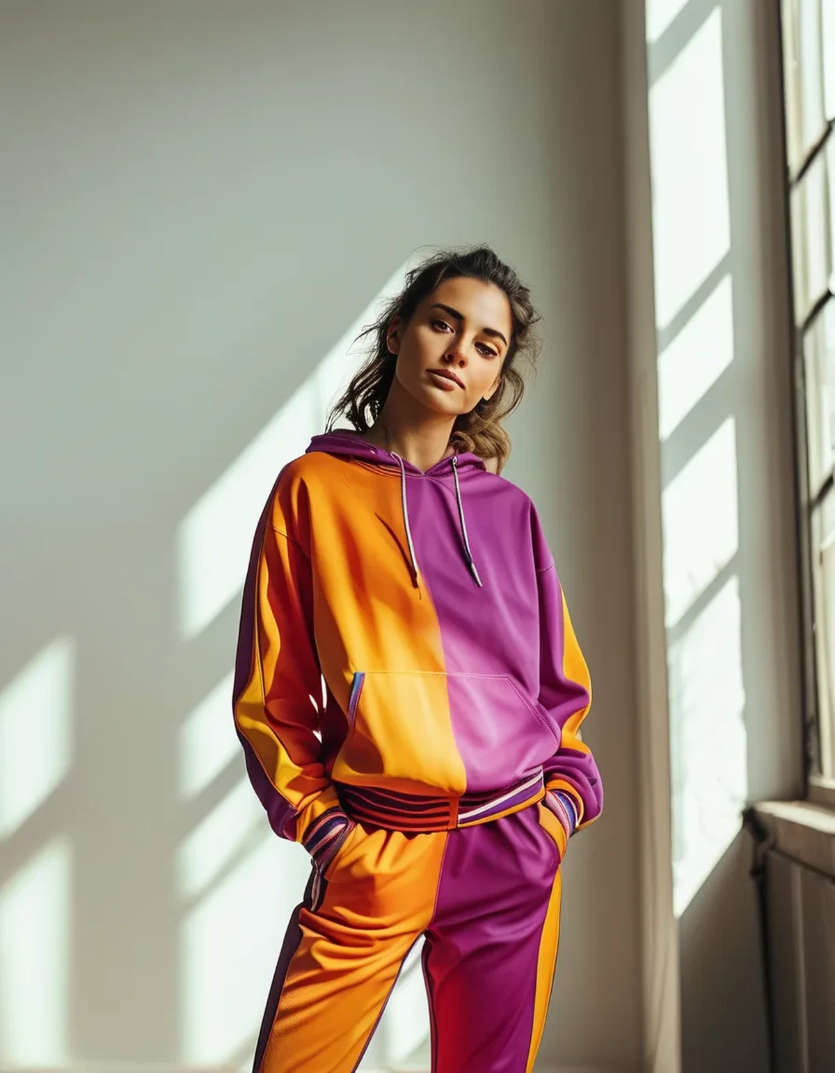
A vertical color block — one color running down one side of the body, a second color down the other, rather than a horizontal top/bottom split — tends to elongate the frame overall, since the eye travels up and down the vertical line rather than settling on a horizontal division point that can visually shorten the torso by creating a clear ‘cut’ at the waist.
Myth vs Fact: Color Blocking and Body Shape
Myth: color blocking only flatters already-lean or athletic body types. Fact: the placement principle works across body types precisely because it’s about directing visual attention, not about hiding or minimizing a shape — the same tool that balances one frame’s proportions works just as directly on a different frame’s proportions in the opposite direction.
Myth: there’s one universally ‘correct’ color block placement everyone should follow. Fact: the correct placement depends entirely on what you personally want to emphasize or balance, which is different for every body and even different for the same body depending on the specific goal of a given outfit.
FAQ: Color Blocking by Body Shape, Answered
Does color blocking work for petite frames without overwhelming them?
Yes, as long as the block sizes stay proportional — very large blocks on a petite frame can visually shorten it, while two well-proportioned blocks (roughly matching your natural top/bottom body ratio) work fine and can even help elongate a smaller frame when used with the vertical placement approach.
What if I don’t know which area I want to balance?
Start by noticing which single item in your closet you reach for most and feel best in — the color and cut you already gravitate toward is a strong hint at what placement will feel most natural to build on, rather than starting from an abstract theory with no personal reference point.
Can I combine three colors in one color-blocked outfit?
It’s harder to pull off than two, but it works if one color takes up the clear majority (following something close to the 60-30-10 proportion) rather than three equal-sized blocks competing for attention and diluting the clear directional effect that makes color blocking useful in the first place.
Does color blocking placement need to change for a top-heavy versus bottom-heavy frame during actual movement, like running or a class?
During dynamic movement, a bold color placed where there’s the most motion (like the legs during running) draws more visual attention simply because motion itself attracts the eye — so for high-movement workouts specifically, placing the bolder block on whichever half moves less can help keep the balancing effect intact rather than being overridden by motion drawing focus elsewhere anyway.
Is there a quick way to test a color block placement before committing to buying new pieces?
Try it first with pieces you already own in roughly the right colors, even if the fit or exact shade isn’t perfect — seeing the proportion and placement effect on your own body in a mirror tells you more in five minutes than any general guide can, and it’s free before deciding what to actually purchase.
TL;DR:
- The boldest color in a color-blocked outfit draws the eye first — use that intentionally
- Bold on bottom, quiet on top balances a fuller upper body; flip it to balance a fuller lower body
- A vertical color split (side to side, not top to bottom) tends to elongate the whole frame
- Three colors work best when one clearly dominates rather than splitting attention evenly
- There’s no single universally correct placement — it depends on what you personally want to emphasize
Keep Reading
This article is for general informational and styling purposes only. Fit, sizing, and product availability may vary.