How to Colorblock When Almost Everything You Own Is Black

Quick Answer: With a mostly black wardrobe, black stops being a colour and becomes the frame. Add exactly one colour, put it in a position you choose deliberately - top for attention upward, shoe or sock for a grounded look - and repeat it once in a small accessory so it reads as a decision rather than an accident. Two new pieces in a single colour will generate more outfits than five pieces in five colours, because every one of them works against everything you already own.
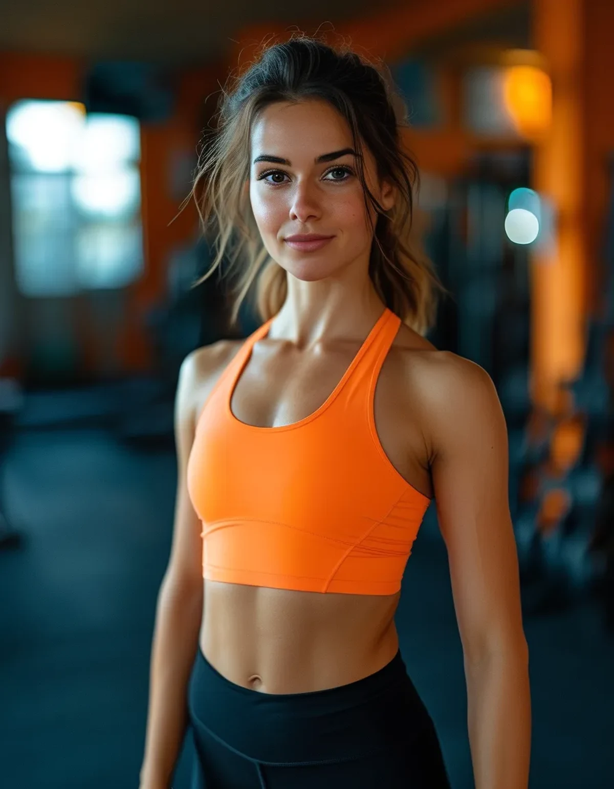
You don’t have a styling problem. You have four black leggings, three black tops, and one orange sports bra you bought on impulse and have worn twice.
Why is an all-black wardrobe actually a good starting point?
Black is the ideal frame for colorblocking. Colorblocking needs clear boundaries between blocks, and there’s no better boundary colour than one that doesn’t compete. A single colour against black reads far cleaner than the same colour against a busy mid-tone.
Everything already matches everything. The hardest part of building outfits is coordination, and you’ve already solved it. Adding colour to a coordinated base is a much easier problem than coordinating colour to colour.
One new piece multiplies rather than adds. A single coloured top that works with four black bottoms produces four outfits. A single coloured top in a wardrobe of mixed colours might produce one.
Black makes bright colours look more expensive. High contrast reads as deliberate and graphic. The same bright against beige or grey reads softer and, frequently, cheaper.
And it removes the undertone problem entirely. Warm versus cool undertone matching is the thing that makes most colour wardrobes difficult. Against black, almost any saturated colour works.
The only real weakness is visibility. All-black is genuinely hard to see in low light, which matters increasingly for anyone training outdoors as the mornings and evenings get darker.
What should you actually add?
One colour, two pieces. Pick a single colour and buy it in two places - say a top and a pair of socks, or a jacket and a headband. Two pieces in one colour lets you repeat the colour within an outfit, which is what makes colorblocking read as intentional.
Choose a saturated colour rather than a pale one. Against black, saturation is what creates the graphic contrast. Pastels against black read washed rather than blocked.
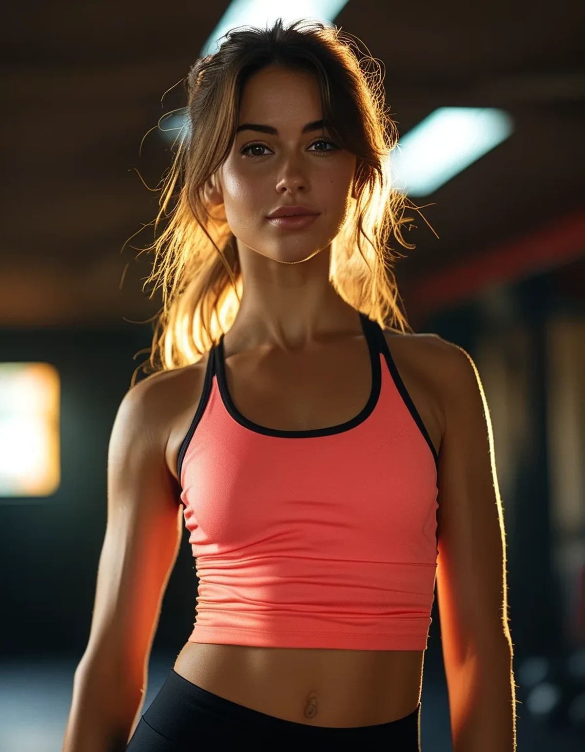
Put the colour where you want the eye. Colour draws attention. A bright top brings attention up toward your face; bright shoes or socks ground the outfit and lengthen the leg line visually when paired with matching-colour leggings hems.
Add a mid-tone neutral as your second addition, not a second colour. Cream, camel, grey, or olive. It softens an all-black-plus-neon look and gives you a three-block option without introducing a second bright to reconcile.
Consider a reflective or light element for the season. A bright colour that also happens to be light-toned solves the autumn visibility problem at the same time as the styling one - it’s the rare two-for-one in this whole area.
And avoid buying five colours at once. It’s the most common mistake, it produces a drawer of single-use pieces, and it’s exactly how people end up with one orange bra they never wear.
Myth vs Fact: Colorblocking on a Black Base
Myth: Colorblocking needs at least three colours. Fact: two blocks is colorblocking. Black plus one saturated colour is a clean, graphic, entirely legitimate version, and it’s the easiest to get right.
Myth: Black is boring. Fact: black is the most flexible base available and it makes everything you put against it look more deliberate. It’s boring when it’s the whole outfit with no anchor point, which is a different problem.
Myth: You should match your bright pieces to each other exactly. Fact: exact matching across brands is nearly impossible and not required. A shared colour family reads as coordinated; the mismatch that actually looks wrong is two versions of almost the same colour.
Myth: Bright colours draw attention to what you’re self-conscious about. Fact: colour placement is a tool you control. Put it where you want the eye and use black where you don’t - that’s the actual mechanic, and it works in either direction.
Myth: You need matching sets. Fact: sets solve the coordination problem for you, but a black base plus separates gives you far more combinations for the same spend.
Myth: Adding colour means abandoning black. Fact: the black is doing the work. Every outfit here is still mostly black - it just has one deliberate area that isn’t.
How do you place the blocks?
Vertical placement decides the proportion. Colour at the top shortens the visual leg line slightly and draws attention upward; colour at the bottom or on the feet lengthens. Neither is better - it’s a choice about emphasis.
Keep the block boundary at a natural line. A colour change at the waist, at the shoulder, or at the ankle reads clean. A colour change at mid-thigh or mid-torso needs to be a designed feature rather than an accident of layering.
Repeat the colour once, in a small area. Bright top plus bright shoelaces, or bright leggings plus a bright hairband. One repetition is what separates styled from random; two repetitions starts to look like a uniform.
Use a jacket as the third block. A neutral mid-tone jacket over black plus one colour gives you a genuine three-block outfit without a second bright, and it’s the most useful layering piece you can own for this.
Symmetry matters less than you’d think. An asymmetric placement - colour on one sleeve, one shoe accent - can look deliberate, but it needs to be clearly a design feature rather than a mismatch.
And check it in a full-length mirror in daylight. Blocks read completely differently in a phone selfie than at full length, and gym lighting flattens the contrast that makes the whole thing work.
FAQ: Colorblocking With Black Activewear, Answered
Can I colorblock with only two colours?
Yes - two blocks is colorblocking. Black plus one saturated colour is the cleanest and easiest version, and it’s the one that works with a wardrobe you already own.
What colour should I add to all-black activewear?
One saturated colour rather than a pastel, bought in two pieces so you can repeat it within an outfit. Saturation is what creates contrast against black; pale colours read washed out.
Where should I put the colour?
Wherever you want the eye to go. Colour up top draws attention toward your face; colour at the feet or hem grounds the outfit. Use black in the areas you’d rather not emphasise.
Do my bright pieces need to match exactly?
No. A shared colour family reads as coordinated. The combination that actually looks wrong is two shades that are almost - but not quite - the same colour.
TL;DR:
- An all-black wardrobe is the best possible base for colorblocking, because black frames rather than competes.
- Add one colour in two pieces, not five colours in five pieces - one colour multiplies across everything you own.
- Choose saturation over pastels; contrast against black is what makes the block read.
- Repeat the colour once in a small area, and use a mid-tone neutral jacket as your third block rather than a second bright.
- Place colour where you want the eye, keep boundaries at natural lines, and check it full-length in daylight.
One orange bra in a black drawer isn’t a colour wardrobe. One orange bra plus orange socks is.
See It in Motion
Seen here: Super High Waist Embossed Yoga Leggings with Inner Pocket — shop it on bubblelime.com
Keep Reading
This article is for general informational and styling purposes only. Fit, sizing, and product availability may vary.