The Color Blocking Mistakes That Make an Outfit Look Costume-y Instead of Intentional
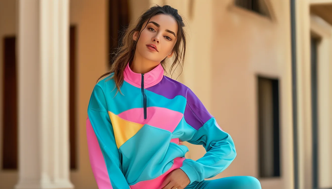
Quick Answer: Color blocking tips into looking costume-y most often from using more than three colors at once, choosing colors of equal visual weight and saturation with no clear dominant tone, or blocking colors in unnatural proportions (like a 50/50 split) rather than a clear majority-and-accent structure.
You tried color blocking hoping for a bold, intentional look, and it landed closer to a costume than an outfit. The gap between the two usually comes down to a few specific, fixable choices.

Why does using more than three colors usually go wrong?
Beyond three colors, the eye struggles to read the combination as a deliberate palette rather than a random assortment — two or three colors maximum is the range most successful color-blocked outfits actually stay within, even ones that read as bold and confident.
What’s the proportion mistake that makes color blocking look off?
A roughly 50/50 split between two colors tends to read as visually competitive rather than intentional — a clearer majority-and-accent structure (roughly 70/30 or 80/20) generally looks more deliberate, since one color reads as the base and the other as a purposeful highlight.

Why does matching saturation levels matter?
Pairing two colors of similar brightness and intensity (two equally saturated brights, for example) competes for visual attention with no clear focal point, whereas pairing one more saturated color with a more muted or neutral counterpart creates a clearer visual hierarchy that reads as intentional.
How does undertone affect whether a color combination works?
Colors with clashing undertones (a cool-toned blue next to a warm-toned orange-red, for example) can create visual tension even when the general color-wheel pairing ‘should’ work — checking that undertones feel complementary, not just checking a general color wheel rule, avoids this specific pitfall.
FAQ: Color Blocking Mistakes Questions, Answered
Is a monochrome color-blocked look easier to get right than a multi-color one?
Yes — blocking different shades of the same color family (tonal color blocking) is generally more forgiving and harder to get visibly wrong than combining fully different hues.
Can accessories be a ‘third color’ safely?
Yes, a single small accessory in a third color (shoes or a bag) can work as an accent without overwhelming a two-color base outfit, as long as it stays clearly secondary in size and visual weight.
Is color blocking more forgiving in activewear than in regular clothing?
Somewhat — the athletic, sporty context of activewear tends to read bold color combinations as intentional more readily than the same combination might in more formal clothing.
TL;DR:
- Stick to two or three colors maximum to avoid a costume-like effect
- Use a clear majority-and-accent proportion rather than a 50/50 split
- Pair one more saturated color with a muted or neutral counterpart, not two equal brights
- Check that undertones feel complementary, not just the general color wheel position
A few proportion and saturation fixes are usually all that separate a costume-y color block from an intentional one.
Keep Reading
This article is for general informational and styling purposes only. Fit, sizing, and product availability may vary.