The Color Blocking Symmetry Mistake That Makes an Outfit Look Unintentional

Quick Answer: Color blocking looks unintentional most often when color divisions don’t align with actual body seams or joints - a color change landing mid-thigh or mid-torso, rather than at a natural seam, waistband, or joint line, reads as accidental rather than designed. Checking that color breaks align with a natural body line fixes most awkward color-block outfits.
Great color choices, good contrast, and it still looks slightly off - the usual reason is where the color actually changes, not which colors were picked.

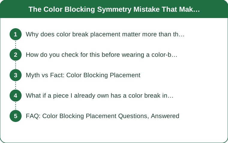
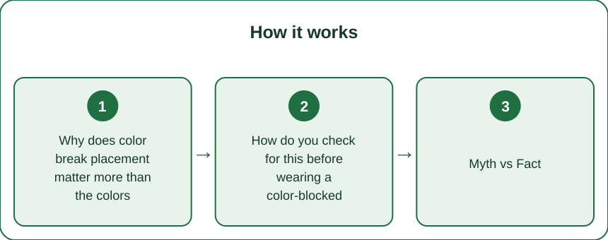
Why does color break placement matter more than the colors themselves?
The eye reads a color change as a deliberate design line, and when that line doesn’t align with an actual body seam or joint, it can visually cut the body at an arbitrary, unflattering point rather than reinforcing a natural line. A color change at the natural waist, a side seam, or a garment’s existing panel line reads as intentional design; the same color change landing at mid-thigh or mid-ribcage reads as a coincidence or mismatch.
This explains why two outfits with nearly identical color choices can look completely different in polish - the colors were secondary to where they actually met.
How do you check for this before wearing a color-blocked piece out?
Look at where each color panel starts and ends in a full-length mirror, specifically checking whether that line lines up with a natural body landmark - waist, hip, knee, or an existing garment seam - rather than falling in the middle of a body segment. If a color change lands mid-thigh or mid-torso with no natural landmark nearby, that’s the specific detail causing the unintentional look.
This check matters most for larger, high-contrast color blocks - subtle tonal color blocking is much more forgiving of placement than bold contrasting color blocks, which draw the eye directly to the dividing line.

Myth vs Fact: Color Blocking Placement
Myth: Bold color contrast is the main risk factor in color blocking looking wrong. Fact: Placement relative to body landmarks matters more than contrast level - a bold contrast at a natural seam looks intentional, while subtle contrast at an arbitrary point can still look accidental.
Myth: Color blocking only works on already-lean or toned bodies. Fact: Correct placement at natural body landmarks works across body types - the placement principle, not body type, determines whether it reads as flattering or awkward.
Myth: More color panels always create a more interesting, dynamic look. Fact: Each additional color panel is another placement decision that can go wrong - fewer, well-placed color breaks often look more deliberate than several poorly placed ones.
What if a piece I already own has a color break in the wrong place?
Styling around it with a layering piece that covers or interrupts the awkward line - a jacket, a longer top layered over the mismatched point - can neutralize the effect without needing to alter the garment itself. This is a practical workaround for pieces you already own rather than a permanent fix.
For pieces worth investing in long-term, a tailor can sometimes adjust a hem or seam to shift a color line closer to a natural landmark, though this depends heavily on the specific garment construction and isn’t always feasible.
FAQ: Color Blocking Placement Questions, Answered
Does this rule apply to horizontal color blocks the same way as vertical ones?
Yes - horizontal color changes have the same landmark-alignment principle, just applied across the body’s width (waist, hip, bust line) rather than along its length.
Is there a safe default color-break point that works for most bodies?
The natural waist tends to be the most broadly flattering and landmark-aligned point for most body types, making it a reasonable default when designing or choosing color-blocked pieces.
Does pattern (not just solid color blocks) follow the same placement rule?
Yes - a pattern change functions visually the same way a color change does, so the same landmark-alignment principle applies to color-blocked patterns as much as solid colors.
TL;DR:
- Color break placement relative to body landmarks matters more than the colors chosen
- Check in a full mirror whether color changes align with a waist, hip, or seam line
- Bold contrast at a natural landmark looks intentional; the same contrast at an arbitrary point doesn’t
- Layering can neutralize an awkwardly placed color break on pieces you already own
Next time a color-blocked outfit feels slightly off despite good color choices, check where the colors actually meet before blaming the palette.
Keep Reading
This article is for general informational and styling purposes only. Fit, sizing, and product availability may vary.