The Two-Color vs Three-Color Rule for Color-Blocking Activewear (Most People Break It)
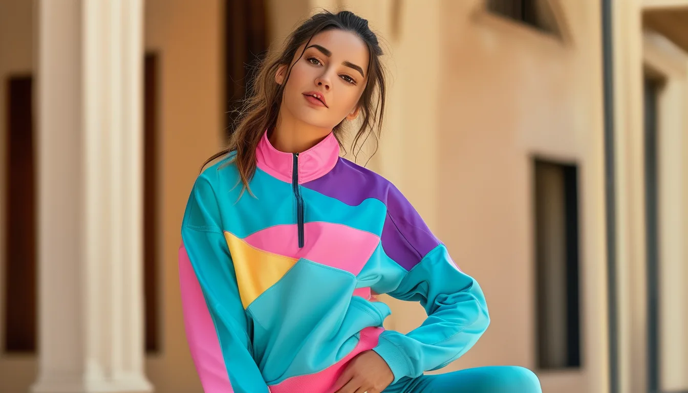
Quick Answer: Stick to two colors plus one neutral (black, white, or gray) as your baseline — three full colors with no neutral anchor is where color-blocking starts to look busy instead of intentional. The neutral is doing more work than people realize.
Color-blocking activewear can look genuinely striking or slightly chaotic, and the difference usually isn’t the colors chosen — it’s how many, and whether there’s a neutral holding it together.
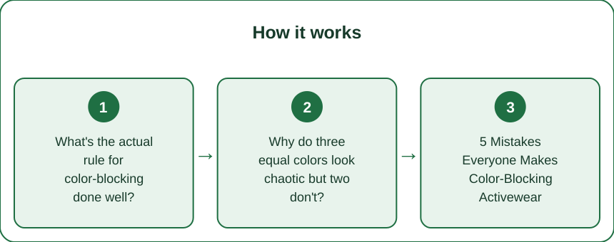
What’s the actual rule for color-blocking done well?
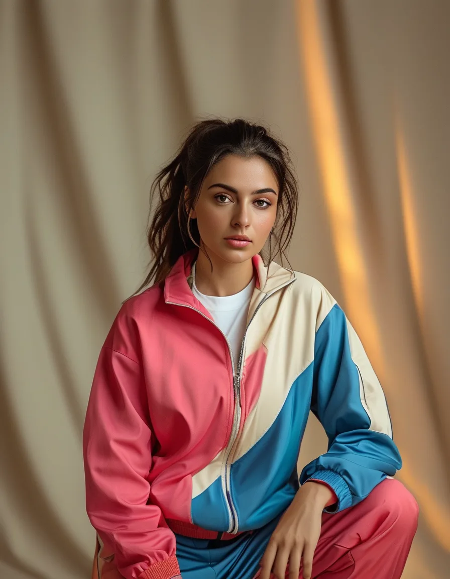
Two colors plus a neutral, or three colors with one clearly dominant. The neutral (black, white, gray, or nude) acts as visual breathing room between the two brighter tones, which is why fully color-blocked outfits with zero neutral often read as busy.
If you’re using three actual colors, one should take up roughly 60% of the outfit while the other two are accents — equal thirds is where it starts to compete.
Why do three equal colors look chaotic but two don’t?
The eye needs a resting point. Two colors plus a neutral gives it one — the neutral. Three fully saturated colors in equal proportion give the eye nowhere to land, which reads as visual noise even when each individual color is fine on its own.
This is the same principle stylists use in fashion generally, just more visible in activewear’s bigger color blocks.
5 Mistakes Everyone Makes Color-Blocking Activewear
1. Choosing colors with no relationship. Random brights together read as accidental rather than styled — pick from the same color family or true complements.
2. Skipping the neutral entirely. Even one small neutral element (shoes, socks, a headband) helps ground a bold combination.
3. Matching saturation levels too closely. A bright with a bright of equal intensity competes; a bright with a slightly muted version of it blends better.
4. Color-blocking top and bottom only, ignoring shoes. Shoes are part of the outfit’s color story whether you plan for them or not.
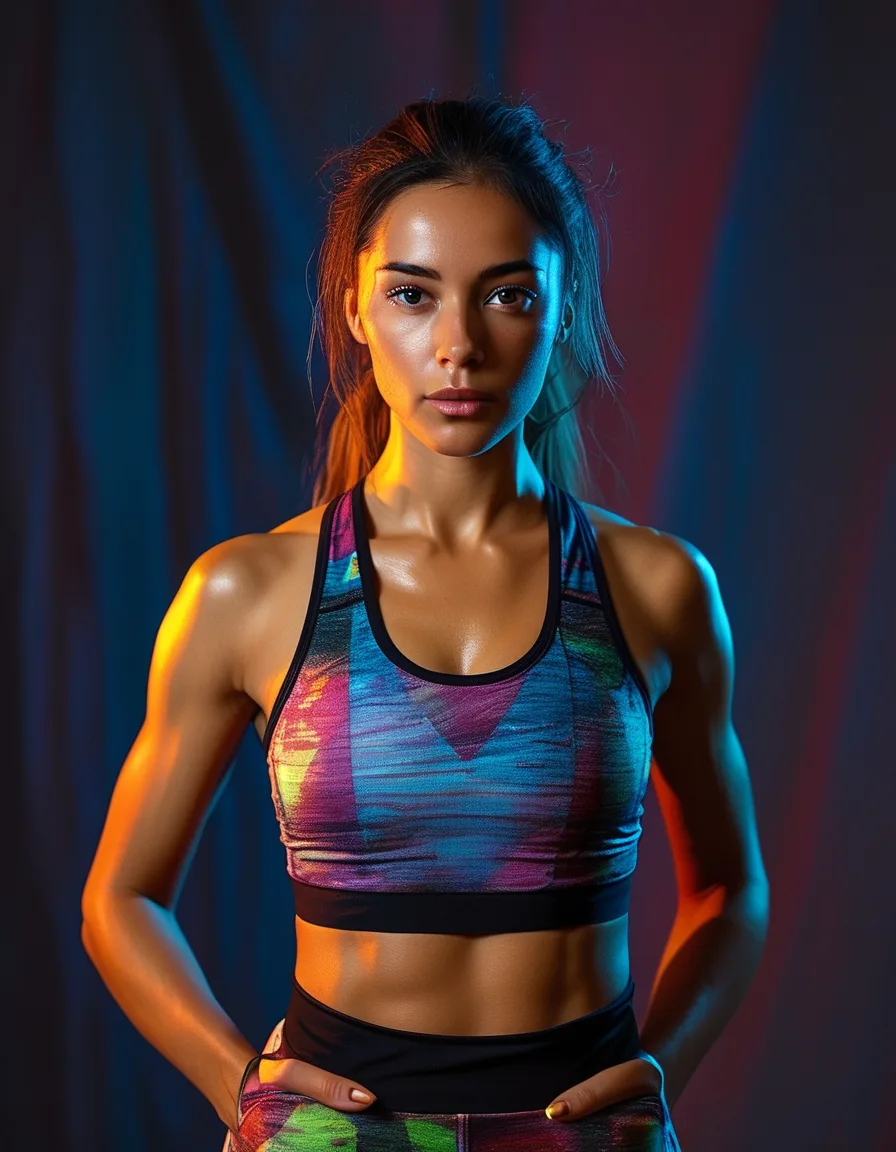
5. Overcomplicating with patterns plus color-blocking. Pick one: bold color blocking or pattern, rarely both at once.
What color combinations work most reliably?
Complementary pairs (colors opposite each other on the color wheel, like teal and coral) tend to look the most intentional. Analogous pairs (colors next to each other, like sage and teal) blend more softly and forgive small mismatches better for beginners to color-blocking.
FAQ: Color-Blocking Activewear Questions, Answered
Can I color block with more than three colors?
It’s possible but harder to pull off — most people get a cleaner result sticking to two colors plus a neutral until they’re comfortable with the balance.
Does color-blocking work for all body types?
Yes — placement matters more than avoiding it. A contrasting color at the waist can define, while the same contrast elsewhere just adds visual interest.
What’s the easiest color-blocking combo for a beginner?
Black, white, and one bold accent color is the most forgiving starting combination — it’s essentially neutral color-blocking with one statement piece.
TL;DR:
- Stick to two colors plus a neutral as the safest baseline
- Three equal-saturation colors with no neutral tends to read as busy
- Complementary color pairs look most intentional; analogous pairs are more forgiving
- Don’t stack bold color-blocking with bold patterns at the same time
The rule isn’t about which colors — it’s about how many, and giving the eye a place to rest.
Keep Reading
This article is for general informational and styling purposes only. Fit, sizing, and product availability may vary.