The Two-Color vs Three-Color Rule for Color-Blocking Activewear (Explained)
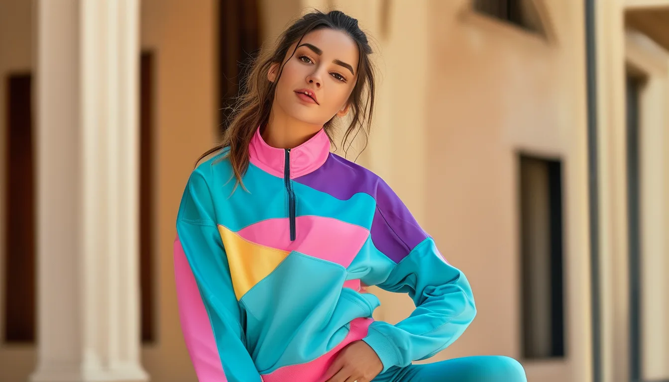
Quick Answer: Two-color blocking (one main color plus one contrast) is the safer, more universally flattering approach and works for almost any body and occasion. Three-color blocking works best when one of the three is a true neutral (black, white, or gray) anchoring the two bolder tones.
Some color-blocked outfits look like they were styled by a professional, and others look like a mismatched laundry accident. The difference isn’t taste — it’s almost always the color count and how the colors relate to each other.
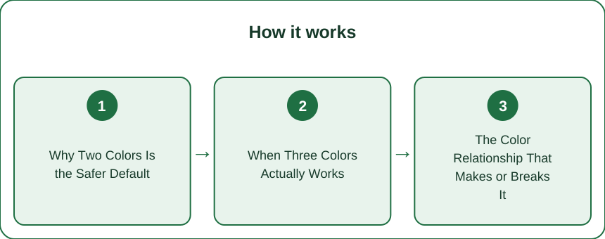
Why Two Colors Is the Safer Default
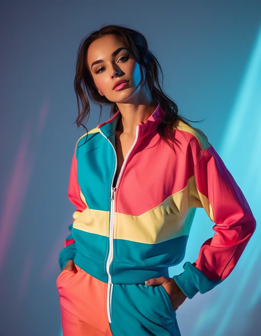
Two-color blocking — one dominant color and one contrast, split roughly at a natural body line like the waist or a diagonal seam — is easier to get right because there’s only one relationship to manage: how the two colors interact. This is why most ready-made color-blocked activewear sets from brands default to two colors: it’s a formula that reliably works across skin tones, body shapes, and color combinations.
For color-blocking beginners, or for everyday wear where you want the look without overthinking it, two colors is the lower-risk, higher-success starting point.
When Three Colors Actually Works
Three-color blocking introduces a second relationship to manage (color A to B, B to C, and A to C), which is why it’s more prone to looking chaotic when done without a plan. The reliable formula: two bold or saturated colors plus one true neutral (black, white, gray, or nude) acting as a visual break between them.
The neutral’s job is to keep the two bold colors from directly competing with each other — without it, three saturated colors together tend to visually fight rather than complement.
The Color Relationship That Makes or Breaks It
Whether you’re using two or three colors, checking their relationship on a color wheel helps predict success. Analogous colors (next to each other on the wheel, like teal and blue) blend smoothly and read as sophisticated. Complementary colors (opposite on the wheel, like orange and blue) create bold, high-contrast impact but need confident styling to avoid looking overwhelming.
Randomly combining colors with no wheel relationship at all — say, a random saturated green next to a random saturated pink — is the combination most likely to look accidental rather than intentional, regardless of whether it’s two colors or three.
5 Mistakes People Make Color-Blocking Activewear
Mistake 1: Using three bold colors with no neutral. Without a neutral anchor, three saturated tones almost always compete rather than complement.
Mistake 2: Splitting colors at an unflattering body line. Color breaks at the widest part of the body can add unwanted visual emphasis there — splitting at the natural waist or a diagonal is usually safer.
Mistake 3: Mixing warm and cool tones without a plan. A warm orange next to a cool blue-toned pink can clash even at similar saturation levels.
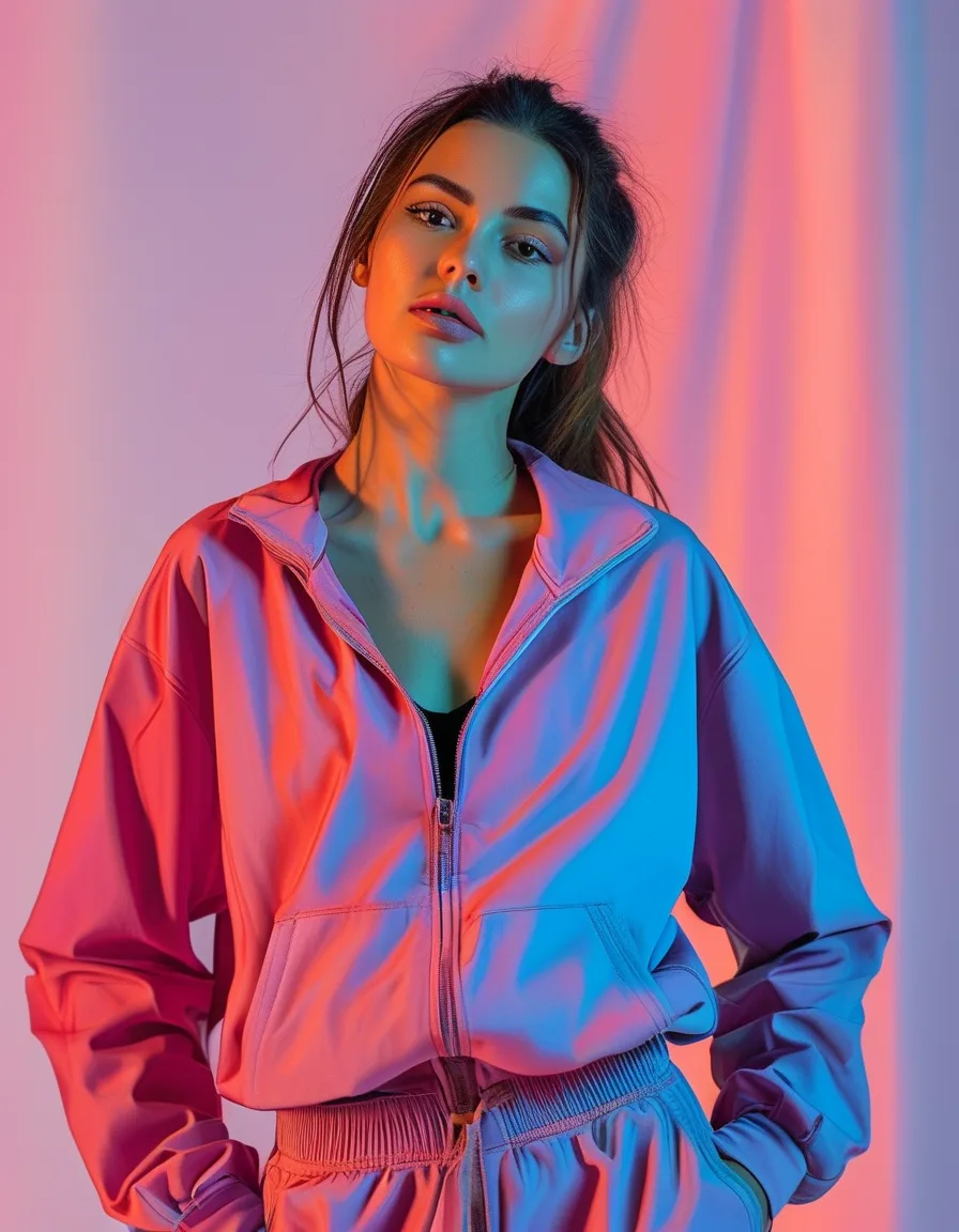
Mistake 4: Ignoring fabric finish differences. Matte and shiny fabrics in the same color-blocked piece can look like a production error rather than an intentional choice.
Mistake 5: Over-relying on trend colors that clash with skin undertone. A trendy color combination doesn’t automatically flatter every skin undertone — checking against your own undertone matters more than following the trend exactly.
FAQ: Color-Blocking Questions, Answered
Is color-blocking flattering for every body type?
Yes, when the color break is placed at a flattering body line (natural waist, diagonal) rather than the widest point — placement matters more than body type itself.
What’s the easiest color combination for color-blocking beginners?
One saturated color paired with black or white is the most foolproof starting combination, since the neutral does all the balancing work automatically.
Can color-blocked activewear be worn outside the gym?
Yes — many color-blocked sets, especially two-color combinations in muted or elevated tones, work well as athleisure for errands or casual outings, not just workouts.
TL;DR:
- Two-color blocking is the safer, more universally flattering default, especially for beginners
- Three-color blocking works when one color is a true neutral anchoring the two bold tones
- Check color relationships on a wheel — analogous blends smoothly, complementary creates bold contrast
- Place the color break at a flattering body line, not the widest point
When in doubt, defaulting to two colors with a clean body-line split is the fastest way to make color-blocking look intentional rather than accidental.
Keep Reading
This article is for general informational and styling purposes only. Fit, sizing, and product availability may vary.