Color Blocking With a Print in the Mix: The One Rule That Keeps It Clean
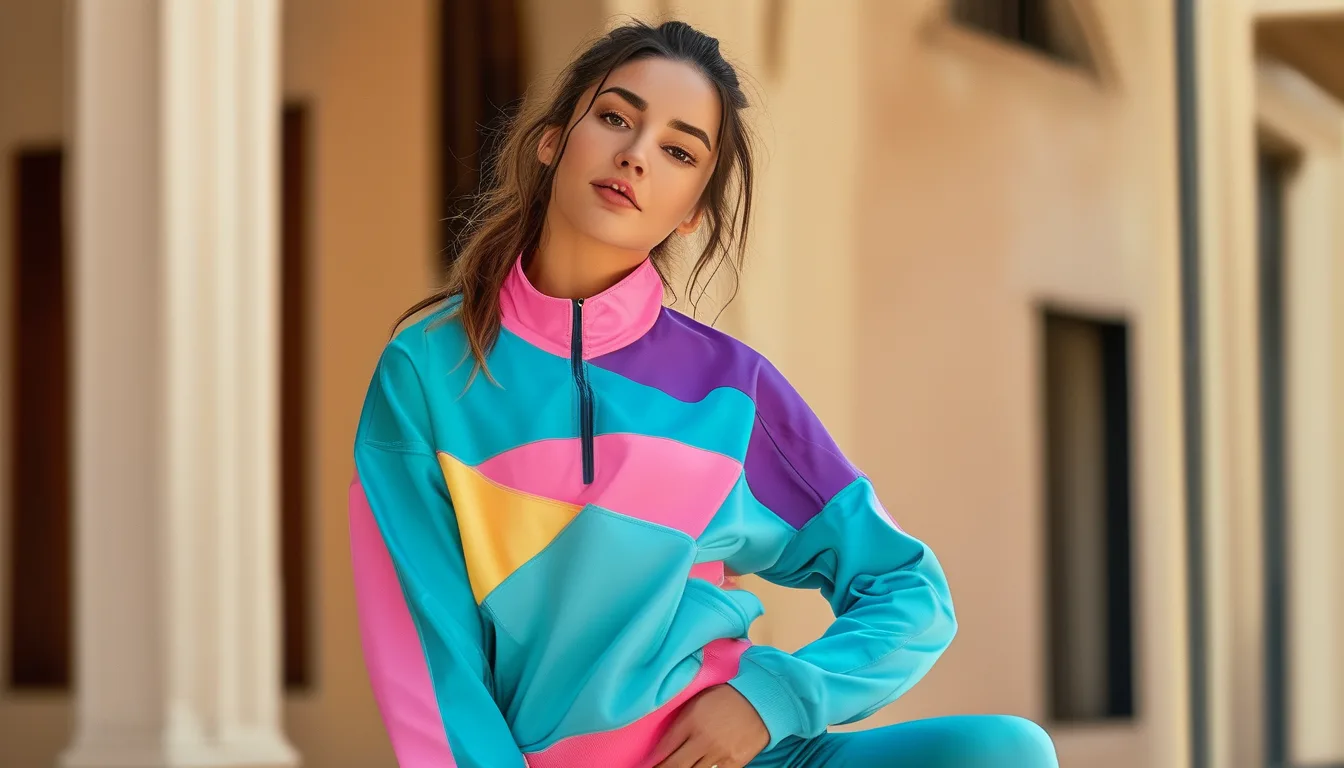
Quick Answer: Pull both of your block colors from inside the print, and cap the outfit at two solids plus one print. The print becomes the source palette rather than a competing element, which is why the outfit reads deliberate instead of busy. If a color in your outfit does not appear somewhere in the print, remove it.
Color blocking is easy with solids. Add one printed piece and the whole thing tips into chaotic for reasons that are hard to name.
The reason is simple: you now have two color stories in one outfit, competing. There is one rule that collapses them into one.
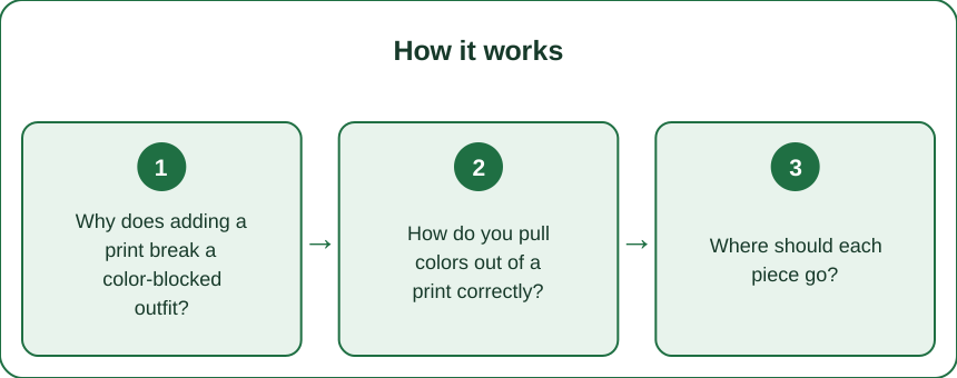
Why does adding a print break a color-blocked outfit?
Color blocking works because it is a controlled palette — two or three colors, deliberately placed, each in a defined area. The whole effect depends on that control being visible.
A print introduces three, five, sometimes seven additional colors, distributed unevenly, in a piece that also has its own pattern rhythm. Your eye now has to reconcile two organizing systems at once, and it reads the result as unresolved rather than intentional.
The common failed fix is to make the solids very neutral — black and white with a busy print — which is safe and also abandons the color blocking entirely. That is a print outfit with neutrals, not a color-blocked one.
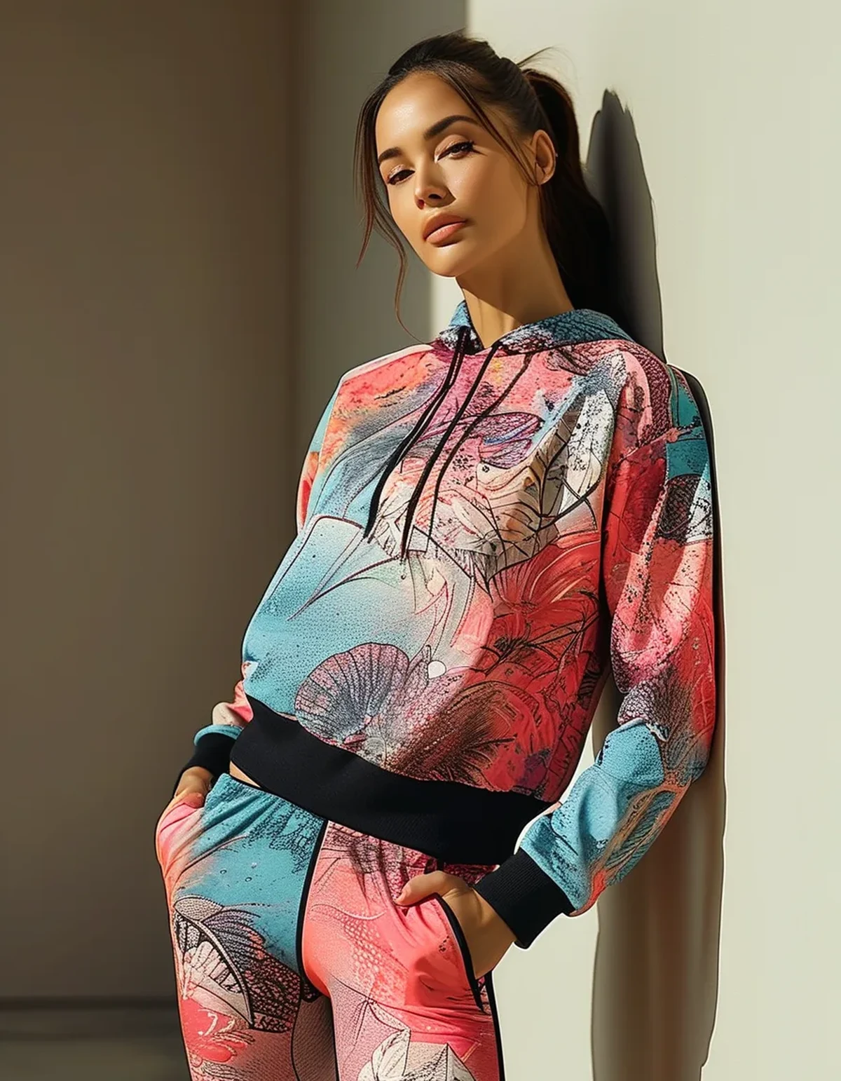
The working fix is to make the print the source of the palette. If both of your solid colors already exist inside the print, there are no competing systems — there is one palette, expressed in two ways. Your eye reads the print as the origin and the solids as the echo, and the outfit resolves immediately.
This is also why an outfit sometimes works by accident. When it does, you almost always picked colors that happened to be in the print.
How do you pull colors out of a print correctly?
Three steps, and step three is where most people go wrong.
1. Photograph the print and shrink it on your phone. Small size shows you which colors actually dominate rather than which ones you notice up close. A print you think of as “blue and orange” is often 70 percent cream with blue and orange accents.
2. Identify the dominant color and one accent. The dominant is the background or the largest area. The accent is any secondary color with a meaningful presence — not a hairline detail.
3. Match the shade, not just the color family. This is the failure point. A dusty sage in the print paired with a bright kelly green solid looks worse than not matching at all, because the near-miss draws attention to itself. Close but wrong is worse than deliberately different. If you cannot match the shade, pick a neutral from the print instead — most prints contain a cream, grey, or black you can use safely.
The fastest reliable pairing: dominant print color as your largest solid area, accent color as the smaller block. Print top, dominant-color leggings, accent-color sports bra or jacket. That works nearly every time.
Where should each piece go?
Placement decides whether the outfit looks composed or scattered.
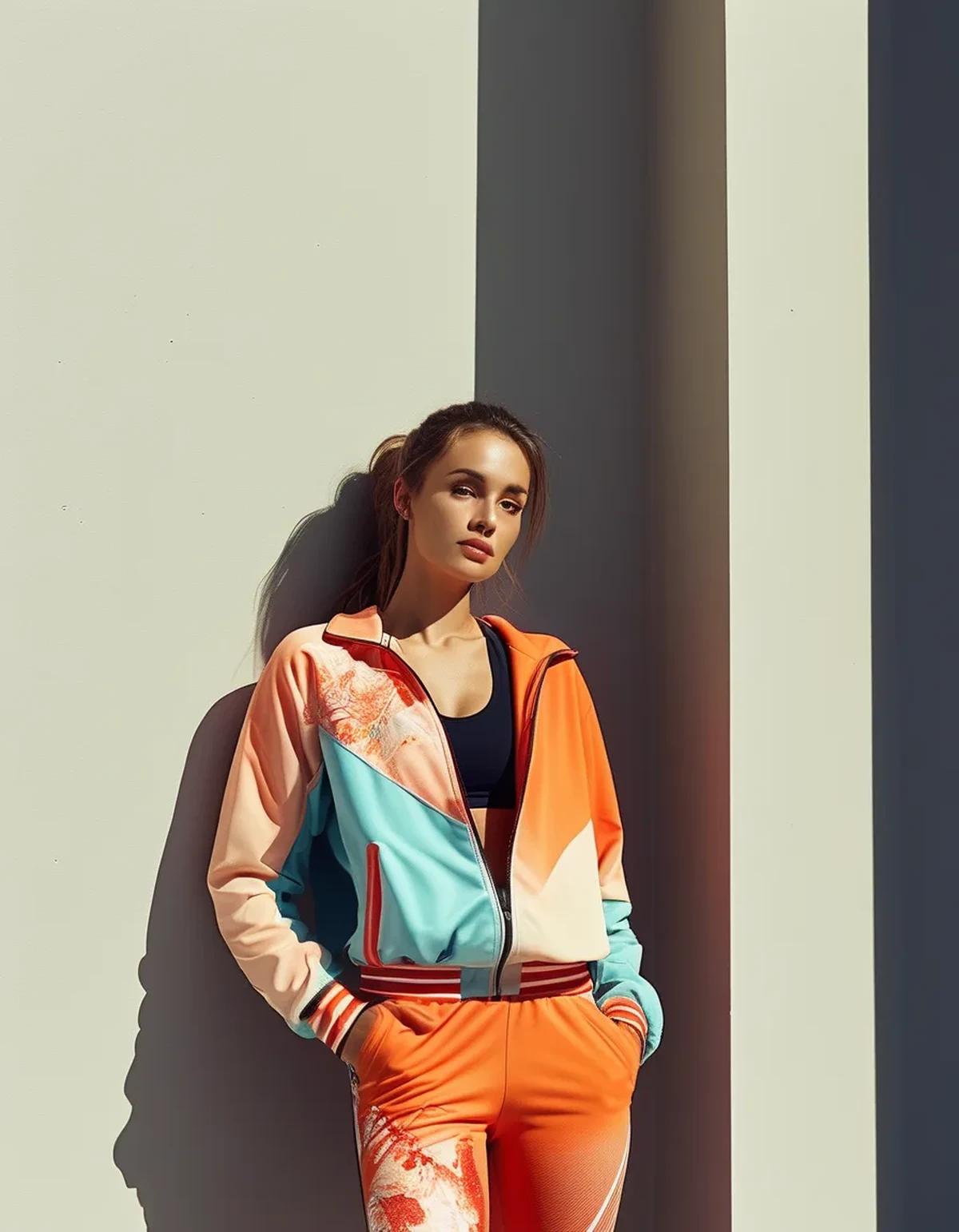
Give the print one continuous zone. A printed sports bra, a printed legging, or a printed jacket — one of them, in one place. Print on top and bottom simultaneously is a different look entirely, and it is not color blocking.
Put the largest solid block adjacent to the print, not separated from it by a third color. Print top with matching leggings reads clean; print top, neutral shorts, then a color at the shoes leaves the palette feeling scattered.
Keep the accent color small and, ideally, repeated. An accent that appears once looks accidental; the same accent appearing twice — a sports bra strap and the shoe, say — looks intentional. Two appearances is the threshold at which a color reads as a choice.
Anchor with shoes in a neutral or the dominant color. Shoes in the accent color work only if the accent is genuinely repeated elsewhere; otherwise they float.
One proportion note: if the print is bold and large-scale, give it the smaller area of the outfit. If the print is small-scale and low-contrast, it can carry the larger area and behave almost like a textured solid.
5 Mistakes That Make It Look Busy
1. Three solids plus a print. The cap is two solids plus one print. A fourth color, even a neutral, is what pushes most of these outfits over the edge. Count before you leave.
2. Matching the color family but missing the shade. Covered above and worth repeating, because it is the most common error. Near-misses read as mistakes; deliberate contrast does not.
3. Using a color that appears nowhere in the print. The simplest possible audit: look at each item, find that color somewhere in the print. If you cannot, remove the item. This single check fixes most failed attempts.
4. Two prints in the name of “pattern mixing.” It is a legitimate technique and it is not color blocking. Doing both in one outfit means neither one reads.
5. Ignoring the logo. A large contrasting brand logo is functionally a fourth color and a competing focal point. On a color-blocked print outfit, a subtle or tonal logo does much better — this is the detail nobody accounts for and it derails outfits that are otherwise correctly built.
FAQ: Print and Color Block Questions, Answered
Can I do this with animal print?
Yes, and it is easier than it sounds — leopard and snake prints function as warm neutrals. Pull the tan and the brown out and block with those, or use the print as the neutral and add one saturated accent such as rust or olive. Cool-toned brights next to leopard are where it goes wrong.
What if the print has too many colors to choose from?
Use the small-photo test and take only the top two by area. Prints with six or more colors work best paired with a single solid pulled from the dominant color, plus a neutral — effectively two solids where one happens to be neutral.
Does this rule work for a full matching print set?
A matching set is already resolved, so you are adding rather than blocking — one solid layer, in a color pulled from the set, worn open. Jacket or quarter-zip. Same rule, one fewer piece.
Is tonal color blocking with a print easier?
Much. Two shades of the same color plus a print containing both is the most forgiving version of this and a good place to start if the whole thing feels risky.
TL;DR: Make the print the source of the palette and everything resolves.
- Pull both solid colors from inside the print. If a color in your outfit is not in the print, remove it.
- Cap it at two solids plus one print. Four colors is where it goes busy.
- Match the shade, not just the color family — a near-miss looks worse than a deliberate contrast.
- Photograph the print small to see which colors actually dominate.
- Give the print one continuous zone, put the largest solid next to it, and repeat the accent twice.
- Watch the logo — a large contrasting one acts as a fourth color.
The entire audit is one question per item: is this color in the print? If not, it goes.
See It in Motion
Seen here: Crewneck Short Sleeve Workout T-Shirt — shop it on bubblelime.com
Keep Reading
This article is for general informational and styling purposes only. Fit, sizing, and product availability may vary.