Colorblock Placement: Why Where the Color Sits Changes Everything
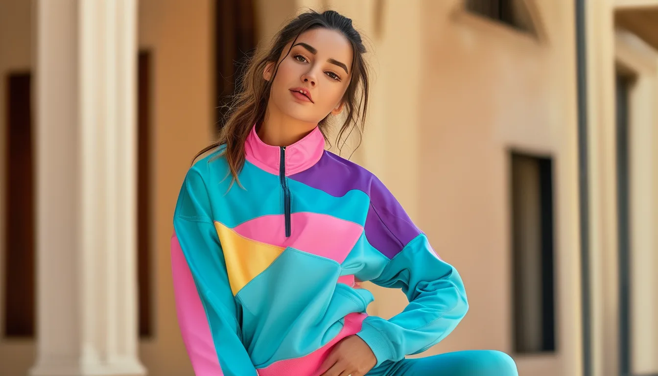
Quick Answer: The eye follows contrast lines and lingers where light colors sit - dark recedes, light advances, and every seam between blocks draws a line the eye reads as a contour. Vertical dark side panels lengthen and narrow; horizontal bands widen whatever they cross; a contrast waistband pulls attention to the waist for better or worse. Decide where you want the eye to land first, then pick the pieces - and let one bright block be the whole event.
Two colorblocked leggings hang side by side in the same two colors. One reads sleek and mile-long; the other somehow shortens the leg it is on. Nothing about the colors changed - only the map. Blocking is optical engineering wearing gym clothes, and the engineering is learnable in five minutes.
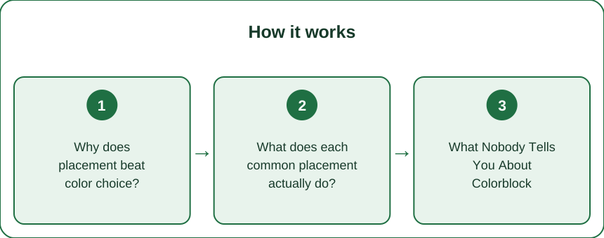
Why does placement beat color choice?
Because colorblocking works on the eye through three mechanisms, and all three are about geography rather than palette.
Mechanism one: the eye rides lines. Every boundary between two blocks is a line, and lines conduct attention. Vertical boundaries pull the gaze up and down, which reads as length; horizontal boundaries sweep it side to side, which reads as width. A chevron or diagonal splits the difference and adds motion. Before asking whether the colors are pretty, ask which direction the seams point - that direction is what the garment is saying.
Mechanism two: value advances and recedes. Lighter, brighter blocks come forward visually and enlarge slightly; darker blocks fall back and contract. This is why the classic dark-outside, light-inside blocking narrows a silhouette: the edges of the body dissolve into shadow while the center panel advances. Flip the same colors - light panels at the sides - and the geometry runs in reverse.
Mechanism three: the eye parks at contrast. Wherever the strongest light-dark collision sits, attention lands and rests. A white stripe meeting black at mid-thigh makes mid-thigh the headline of the outfit. This is neither good nor bad - it is a spotlight you get to aim, and aiming it consciously is the entire skill.
Put together: a colorblocked piece is a set of instructions telling the viewer where to look and what shape to see. Most people buy the colors. The garment was always selling the map.
What does each common placement actually do?
A field guide to the blockings you will actually meet on the rack.
Dark side panels, lighter center. The workhorse. Vertical dark bands down the outer leg narrow the silhouette and lengthen the line - the effect survives motion and photographs, which is why this blocking never leaves production. The deeper the side color relative to the center, the stronger the carve.
Contrast waistband. A light or bright band at the top pulls the eye straight to the waist. On a high-waisted legging that hits the natural waist, this frames the narrowest point - a win. A band that lands lower, at the widest part of the hip, aims the same spotlight at the spot most people would rather not headline. Check where the band actually sits on you, not on the model.
Horizontal thigh or knee bands. These cut the leg’s vertical line where they cross, visually shortening it - a deliberate sporty look, best carried by monochrome above and below so only one interruption exists. Bands at the widest point of the thigh or calf also widen it; bands at narrow points - just above the knee, at the ankle taper - are far more forgiving.
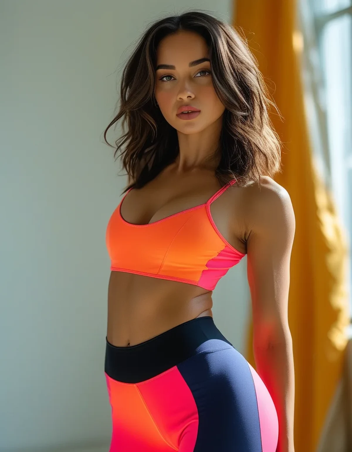
Bright top, dark bottom - or the reverse. Blocking across pieces counts too. The bright piece is where the eye goes: bright sports bra with black leggings sends attention up to shoulders and face; bright leggings under a black tank send it down. Neither is wrong - it is proportion steering, free of charge.
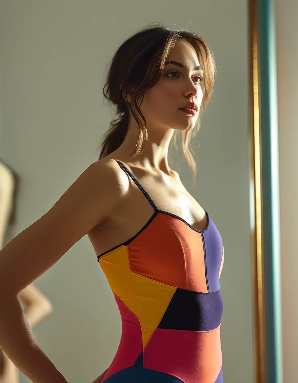
Diagonals and curved panels. Lines that sweep from outer hip toward inner knee trace an hourglass contour the eye obligingly follows. The most flattering engineered leggings are quietly built from exactly these curves.
What Nobody Tells You About Colorblock
The seams are doing half the work. On solid leggings, seam placement already sculpts - princess lines, curved yoke seams, gusset geometry. Colorblocking simply inks those lines in. A well-cut solid with contoured seams flatters more than a badly mapped colorblock, which is why cut outranks color at the rack.
Contrast panels are honesty panels. A pale block stretched over its capacity announces the strain - the fabric lightens further and the boundary line bows outward. Whatever size you wear in solid black, the same size in a light-paneled colorblock has less forgiveness; when between sizes, size for the palest panel.
Cameras amplify blocking. Contrast boundaries read stronger in photos than in mirrors - the narrowing tricks work harder on camera, and so do the widening mistakes. If an outfit is for a photographed event, judge it through your phone camera, not just the mirror.
Blocked pieces date faster than solids. Specific block layouts and color pairs mark their season the way prints do. The budget logic follows: trend-priced blocking, investment-priced solids - the solids will still be anonymous and current in three years.
Care keeps the contrast. A colorblock lives on the crispness of its boundaries. Wash cold, inside out, no dryer - both to stop the dark panels fading and to prevent the slow dye migration that can blur a light panel beside a saturated one. A softened boundary reads as wear faster than actual wear does.
How do you pick blocks for your goals?
Work backwards from where you want the eye, then let the map follow.
Want longer-looking legs: unbroken vertical lines from waist to hem - dark side panels, or a single column of color with no horizontal interruptions - and keep any contrast low on the leg near the ankle taper. Pair with a matching-tone shoe and the line runs to the floor. Petite frames get the most from exactly this and lose the most to horizontal bands.
Want waist definition: contrast belongs at the natural waist - a bright band on a true high-rise, or curved dark panels that sweep inward at the waistline. Above and below, keep blocks quieter so the waist stays the headline.
Want to de-emphasize hips or thighs: dark blocks over the zone, light blocks and interest elsewhere - a bright chest panel, a light waistband, color at the shoulders. The eye goes where the light is; send it there.
Want balance for proportions: aim brightness at the smaller half. Lighter or blocked top over dark bottoms balances a fuller lower half; bright or blocked leggings under a dark relaxed top balance broader shoulders.
Want a foolproof starting point: the one-bright-block rule. Choose a piece with a single confident block - dark side panels, one chevron, one contrast band at the right height - and keep every other garment solid. One statement per outfit reads intentional at any budget; three statements read like the sale rack won.
And whatever the goal: walk, sit, and squat in the mirror before buying. Blocks are mapped on a standing body - the map has to survive motion, because you will be moving in it.
FAQ: Colorblock Questions, Answered
Are colorblock leggings flattering?
The placement decides. Vertical dark side panels and diagonal contour lines narrow and lengthen; horizontal bands at wide points do the opposite. Same colors, different map, opposite result - judge the geometry before the palette.
Where should the dark color be on colorblock leggings?
Wherever you want to recede - most commonly the outer legs and the zones you would rather not spotlight. Dark contracts and light advances, so the light blocks mark exactly where the eye will land.
Do horizontal color blocks make you look wider?
Bands widen whatever they cross and shorten the vertical line they interrupt - strongest at the widest points of thigh or calf, mildest at natural taper points like above the knee or at the ankle. Placed deliberately, that width can balance; placed carelessly, it just widens.
How do I style colorblock leggings without clashing?
Let the leggings be the single event: solid top in one of the block colors, matching-tone shoes, minimal accessories. Repeat one color from the blocking somewhere above the waist and the whole outfit reads planned.
TL;DR:
- Blocking is geometry first: seams steer the eye, dark recedes, light advances, contrast is a parked spotlight.
- Vertical dark side panels lengthen; horizontal bands widen and shorten; contrast waistbands frame whatever they actually sit on.
- Size for the palest panel, judge outfits through the camera, and buy blocking at trend prices while investing in solids.
- One bright block per outfit, chosen for where you want the eye - then solids everywhere else.
Every colorblocked garment is aiming a spotlight somewhere. The whole skill is holding the flashlight yourself.
See It in Motion
Seen here: High Waist Yoga Leggings with Side Pockets — shop it on bubblelime.com
Keep Reading
This article is for general informational and styling purposes only. Fit, sizing, and product availability may vary.