Colorblocking for Photos: What Actually Reads Well on Camera
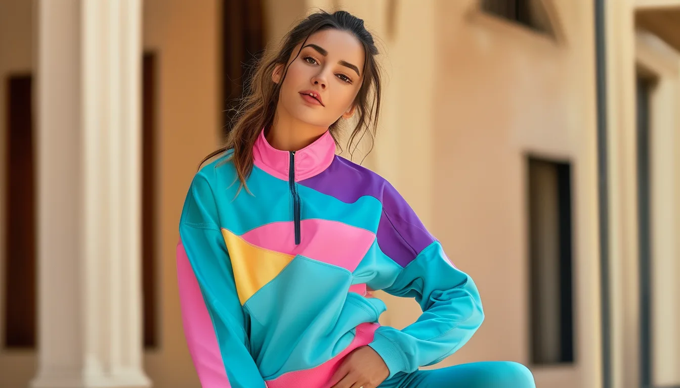
Quick Answer: Cameras compress tonal range, so colorblocking that relies on two similar-value colors collapses into one shape on screen. What survives is value contrast - a genuinely light block against a genuinely dark one - plus large blocks rather than small ones. Two colors photograph better than three, and a hard edge between them photographs better than a gradient.
Colorblocking is one of the few styling approaches that can look better in photos than in person, but only if it is built on value rather than hue.
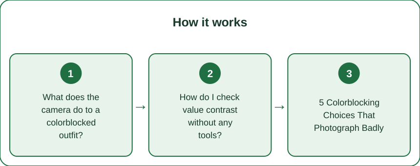
What does the camera do to a colorblocked outfit?
It flattens value differences and exaggerates hue differences, which is roughly the opposite of what your eye does.
In person, you perceive two mid-tone colors - say a sage green and a dusty blue - as clearly distinct because your visual system is excellent at hue discrimination. A camera sensor records the light intensity, then processing compresses the tonal range to fit the display.
The result: two colors of similar lightness merge into a single visual block even though their hues differ. The colorblocking disappears and you are left with what reads as one slightly patchy garment.
The fix is to build on value - how light or dark a color is - rather than on hue. Squint at your outfit in a mirror. If the blocks blur together when you squint, they will blur together on camera.
How do I check value contrast without any tools?
Two methods, both free and both take seconds.
The squint test. Squint hard at the outfit in a mirror. Squinting reduces the detail your eye receives and approximates what tonal compression does. Blocks that stay distinct will photograph distinctly.
The greyscale test. Take a photo on your phone and apply a black-and-white filter. If the two colors become the same grey, they have the same value and will not read as separate blocks. This is the more reliable of the two and it takes about 15 seconds.
Most people are surprised by how many of their favorite pairings fail this. Sage and dusty rose, navy and forest green, taupe and olive - all common activewear combinations, all nearly identical in value.
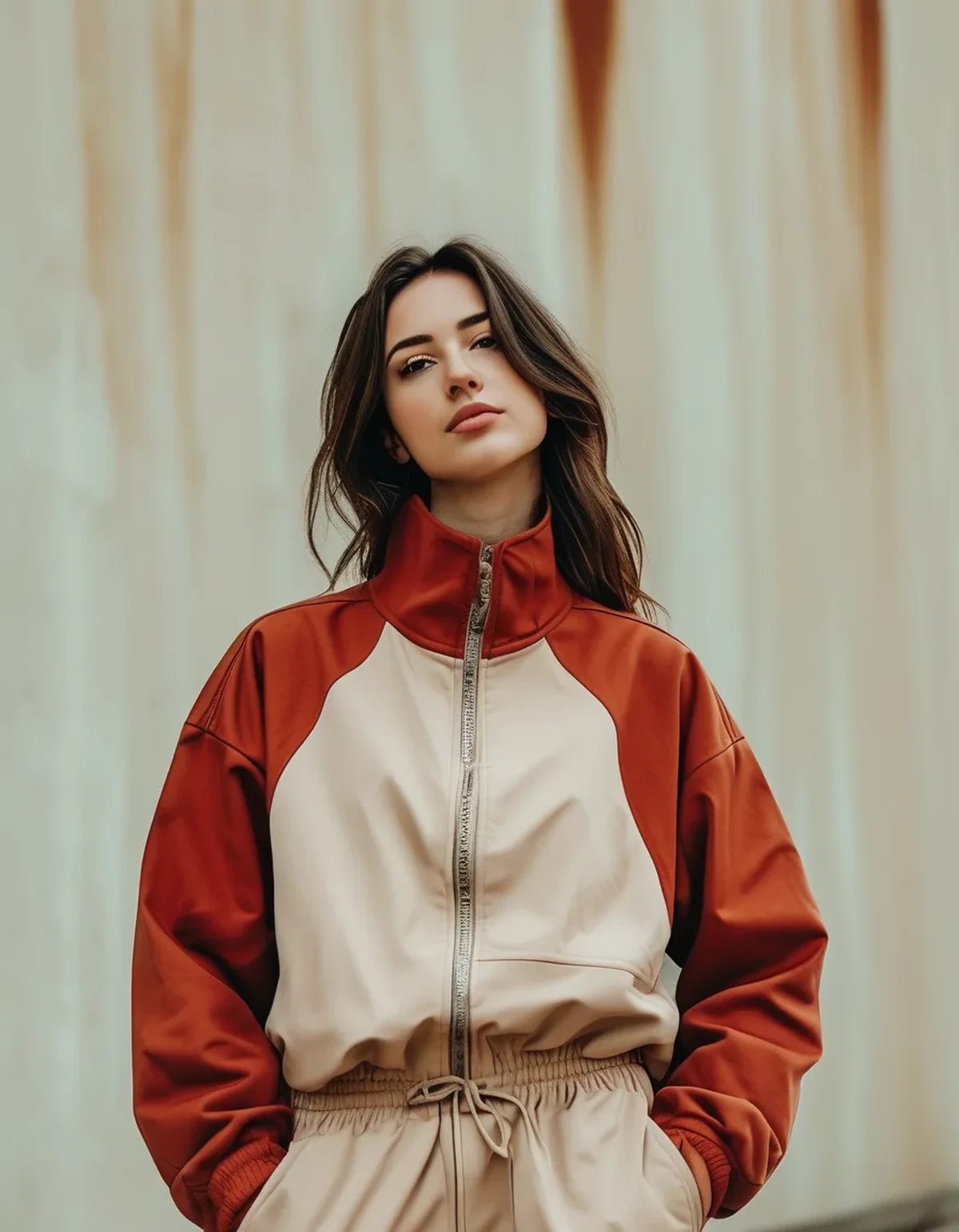
The pairings that pass are the obvious ones: cream against black, white against navy, pale grey against rust, butter yellow against charcoal.
5 Colorblocking Choices That Photograph Badly
- Three colors instead of two. Each additional block subdivides the frame and reduces the size of each shape. Two large blocks photograph dramatically better than three medium ones.
- Small blocks or thin panels. Side stripes, thin contrast piping, and small color panels vanish at any distance beyond about six feet.
- Matching value, differing hue. The squint test failure. This is the most common mistake and the least obvious in person.
- A horizontal break at your widest point. Cameras exaggerate horizontal lines. Place the break above or below the widest part of your body rather than across it.
- Busy backgrounds. A colorblocked outfit against a colorblocked background - a patterned wall, a crowded gym, a park - loses its structure entirely.
The third one is why a set you love can look accidentally dull in every photo you have of it.
Where should the break go?
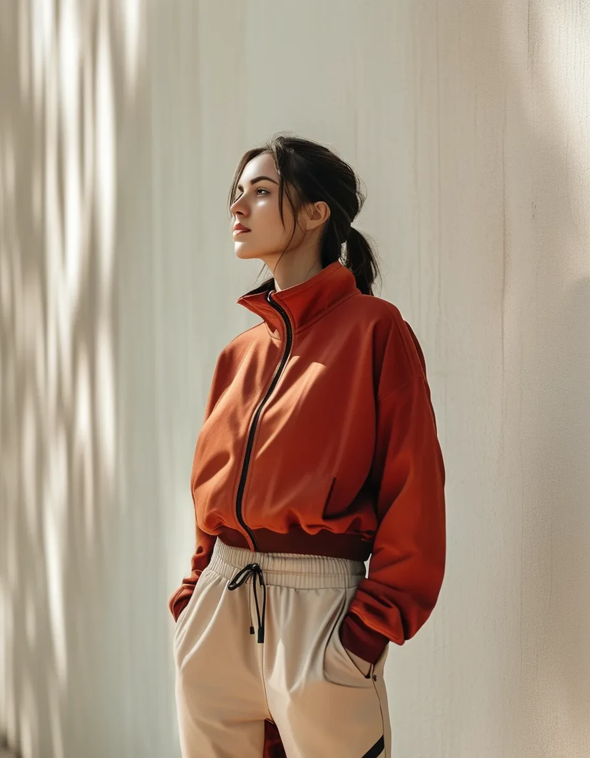
The break line is the most powerful variable and the one nobody adjusts deliberately.
High break - at the sternum or above. Draws the eye up, elongates the body below it. Works well for a light top block over a dark bottom.
Waist break. The default and the safest. Reads as intentional, defines the waist. Best when the top block is lighter.
Low break - at the hip or upper thigh. Creates a long torso line. Effective with a dark top and lighter bottom, though this arrangement is generally harder to pull off.
Diagonal break. Photographs beautifully because a diagonal is inherently dynamic and cameras handle it well. Underused.
The rule that holds across all of them: avoid a horizontal break at the widest point of your body, because photographic compression emphasizes exactly that line. Move it two inches up or down and the whole photo changes.
What colors work right now?
Late August into September is a genuinely good moment for colorblocking, because the seasonal palette shift gives you high-value-contrast pairs that also feel current.
Cream with rust. High value contrast, warm, unmistakably transitional. Probably the strongest pairing available this month.
Charcoal with butter yellow. Very high contrast, and yellow photographs vividly without the harshness of neon.
Off-white with deep olive. Reads as fall without going dark, and both are common in activewear ranges.
Black with pale blue. The most reliable year-round high-contrast pair.
What to move away from as the season turns: the summer brights against white, which read slightly out of step by mid-September even though they photograph well.
One practical note - a warm-toned color in the block nearest your face counteracts the slightly cool cast most phone cameras apply, and makes a noticeable difference in how the photo reads overall.
FAQ: Colorblocking and Photos Questions, Answered
Does this apply to mirror selfies too?
More so. Mirror photos add a layer of reflection that reduces contrast further, and gym mirror lighting is usually poor. Value contrast matters even more there.
Should I avoid patterns entirely with colorblocking?
One small pattern in a shoe or bag is fine and can help. A patterned garment plus colorblocking gives the camera too much to resolve and usually reads as visual noise.
What about lighting?
Even, diffuse light - overcast, open shade, or an hour after sunrise - preserves block edges. Hard midday sun adds shadow lines that compete with the actual color breaks.
TL;DR:
- Cameras compress value differences, so blocks with similar lightness merge into one shape.
- Use the greyscale test - photograph the outfit and apply a black-and-white filter. Same grey means it will not read.
- Two large blocks beat three medium ones. Small panels and thin stripes disappear on camera.
- Move the horizontal break off your widest point. Diagonal breaks photograph especially well.
- Cream with rust and charcoal with butter yellow are the strongest transitional pairings right now.
The greyscale check takes fifteen seconds and will change which sets you reach for on the days you know photos are happening.
Keep Reading
This article is for general informational and styling purposes only. Fit, sizing, and product availability may vary.