Colorblocking With What You Already Own: A Three-Rule System
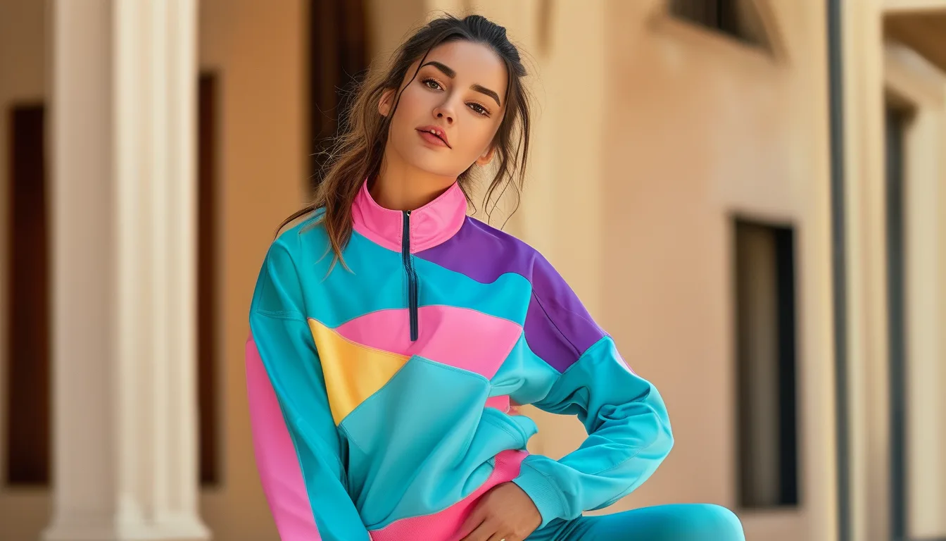
Quick Answer: Colorblocking works when the colours have a defined relationship - opposite each other on the colour wheel, next to each other, or one colour with one neutral. It fails when the two colours are close but not matching, which reads as an accident rather than a choice. Three rules cover almost every combination in a normal activewear drawer.
The difference between a styled outfit and a laundry-day outfit is not the pieces. It is whether the colours are related on purpose.
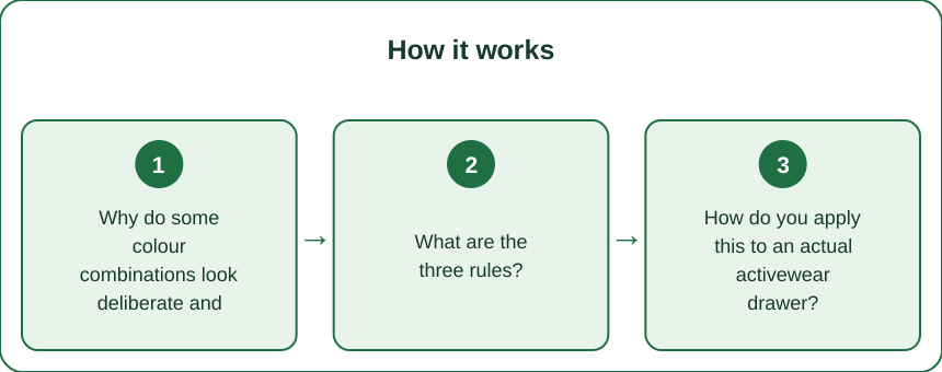
Why do some colour combinations look deliberate and others look accidental?
Because the eye reads relationships, and there is one relationship that always fails.
Colours that are clearly different read as a choice. Navy and orange. Black and lime. Burgundy and pink. The contrast is large enough that nobody could think it was unintentional.
Colours that are identical read as a set. Obviously fine.
Colours that are close but not the same read as a mistake. This is the failure mode, and it accounts for almost every activewear outfit that feels slightly off. Navy with black. Charcoal with dark grey. Two different blacks that have faded differently. The eye registers the mismatch as an attempt at matching that failed.
So the rule that follows: commit to obviously different or exactly the same. The middle is where outfits go wrong, and it is also where most people’s drawers naturally sit, because activewear accumulates in similar dark neutrals.
This also explains the faded black problem. Black leggings washed thirty times next to a new black top is a close-but-not-matching pair. It is the single most common accidental version of this failure, and it is invisible until it is pointed out.
What are the three rules?
Each one produces a reliable combination, and between them they cover almost any drawer.
Rule 1 - Opposite on the colour wheel (complementary). Maximum contrast, maximum impact.
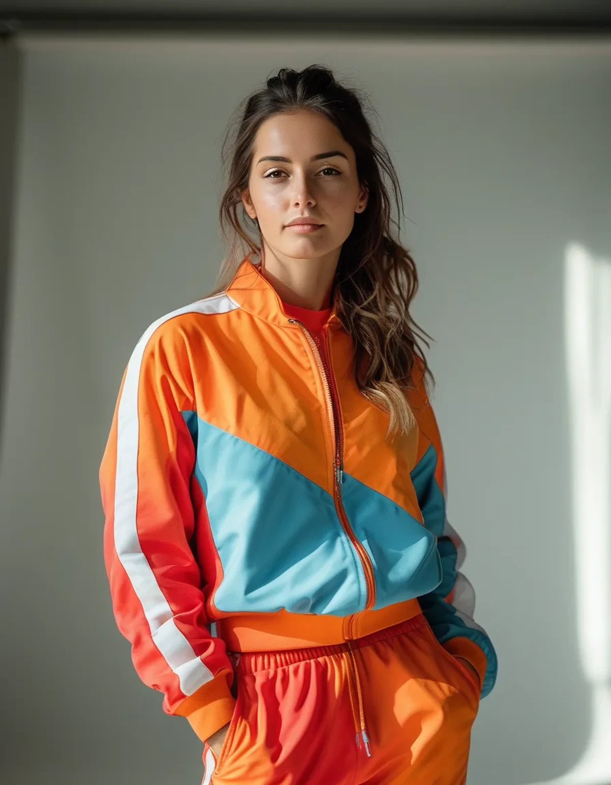
- Blue and orange
- Purple and yellow
- Red and green
- Pink and teal
These pairs vibrate against each other, which is exactly the point. Use one as the dominant and one as the accent rather than 50/50, which is harder to wear.
Rule 2 - Neighbours on the colour wheel (analogous). Lower contrast, more harmonious, easier to wear.
- Blue and teal and green
- Pink and coral and orange
- Purple and burgundy and red
These read as a considered palette rather than a contrast. This is the more wearable of the two and the better starting point for anyone who finds bold combinations uncomfortable.
Rule 3 - One colour, one neutral. The easiest and the one most people default to without knowing why it works.
- Any bright with black, white, charcoal, navy, cream, or beige
- The neutral gives the eye somewhere to rest, which is what makes the colour feel deliberate rather than loud
And the meta-rule across all three: two colours maximum, plus a neutral. Three colours is possible and it is considerably harder, and it is where most attempted colourblocking tips into looking chaotic.
How do you apply this to an actual activewear drawer?
Practically, because most drawers are mostly black.
Start by sorting into three piles: neutrals (black, grey, white, navy, beige), brights, and muted mid-tones.
If your drawer is mostly neutral, you need one colour piece to make any of this work. One bright sports bra or one bright top is enough to produce a dozen outfits under Rule 3.
If you have several brights, check them against the wheel. Pieces that are complementary or analogous can go together; pieces that are neither generally cannot unless you separate them with a neutral.
The separation trick: a neutral piece between two clashing colours defuses them. Bright pink top, black leggings, orange jacket works where bright pink top and orange leggings does not.
On proportion: the dominant colour should be the larger area. Leggings are the biggest visual block, so a bright legging is a much stronger statement than a bright bra. Beginners find it easier to keep the bright on top.
On shoes: trainers are a third colour whether you planned for it or not. White and black trainers function as neutrals; coloured trainers need to belong to one of your two colours or the outfit now has three.
And the practical audit: look for the close-but-not-matching pairs in your drawer - the two navies, the faded black and the new black. Those are the combinations to separate, and identifying them takes five minutes.
What Nobody Tells You About Colorblocking
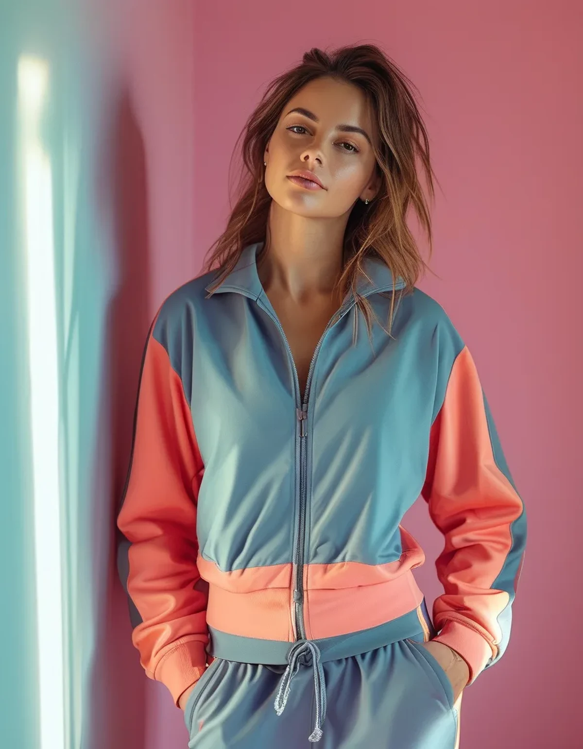
Matching sets are the easiest version of this and they are also the least interesting. A set removes the decision entirely, which is why they sell so well - and deliberately mixing produces something that looks more considered, not less.
Colour placement changes your proportions. A contrasting waistband or a colour break at the hip draws the eye horizontally at that point. A vertical colour panel down the side of a legging does the opposite. Neither is better - it is worth knowing which effect you are producing.
Saturation should be roughly consistent between your two colours. A dusty pastel next to a neon reads as mismatched even if the hues are technically complementary. Match the intensity, not just the relationship.
Your skin tone matters less than the internet suggests, with one caveat: the colour directly next to your face - the top - has the biggest effect on how you look, and that is worth being choosier about. The leggings can be anything.
Black is not automatically slimming and white is not automatically the opposite. Fit and cut do far more than colour, and a well-fitting bright legging looks better than a poorly-fitting black one.
Photography lies about colour. Screen colours differ substantially from the physical garment, which is why online activewear colours so frequently disappoint. Buying a second piece to match one you own, from a photo, is unreliable - and it is the single most common way people end up with the close-but-not-matching problem.
And the honest one: nobody at the gym is analysing your colour theory. The value of this is that you feel put together, which does affect whether you show up. That is a completely sufficient reason.
What are five combinations to try this week?
1. Bright coral top + navy leggings + white trainers. Complementary-adjacent, high contrast, and it works with the coral pieces everyone has left from summer.
2. Teal top + black leggings + black trainers. Rule 3 at its simplest - one colour, one neutral, nothing to think about.
3. Burgundy top + dusty pink leggings. Analogous, low contrast, and one of the more sophisticated-looking combinations available. Seasonally correct for the next two months.
4. Olive leggings + cream or oatmeal top + white trainers. Two near-neutrals with enough difference to read as deliberate. The easiest autumn version.
5. Bright yellow sports bra + charcoal leggings + grey oversized top over the top. The accent version - the colour is a small area, framed by neutrals, which makes a bold colour easy to wear.
Across all five: two colours maximum, one clearly dominant, and consistent saturation. That is the entire system, applied to pieces most drawers already contain.
FAQ: Activewear Colorblocking Questions, Answered
How many colours can I wear at once?
Two, plus a neutral. Three colours is possible and considerably harder to get right, and it is where most attempts start to look chaotic rather than styled.
Do my leggings and sports bra have to match?
No - and deliberately mismatching usually looks more considered than an accidental near-match. What to avoid is two colours that are close but not the same.
What colours go with black leggings?
Almost anything, which is why they are the default. The one thing to watch is another black or dark navy piece that has faded differently.
Are matching sets worth buying?
They are the easiest option and they remove all decisions, which has real value. They are also the least distinctive, so a set plus a few mixable separates covers more ground than several sets.
How do I stop my black pieces fading unevenly?
Wash cold, inside out, no fabric softener, no tumble dryer. Uneven fading is what creates the close-but-not-matching problem in an otherwise all-black drawer.
TL;DR:
- Colours that are obviously different or exactly the same both work; close-but-not-matching is the failure
- Three rules: complementary opposites, analogous neighbours, or one colour with one neutral
- Two colours maximum plus a neutral, one clearly dominant, consistent saturation between them
- Trainers count as a third colour unless they are black or white
- Audit your drawer for the two navies and the faded black - that pair is the usual culprit
The pieces are fine. The relationship between them is the whole thing.
See It in Motion
Seen here: UPF 50+ Short Sleeve Rashguard Swim Shirt — shop it on bubblelime.com
Keep Reading
This article is for general informational and styling purposes only. Fit, sizing, and product availability may vary.